IDENTITY: Foster Care Health Data Portal
Critical medical and legal information for foster children moved by mail and paper, creating dangerous delays. I designed a secure digital portal connecting Cincinnati Children's Hospital and Hamilton County Jobs & Family Services — building the information architecture from users' own mental models and iterating the design through three rounds of testing until it matched how people actually worked.
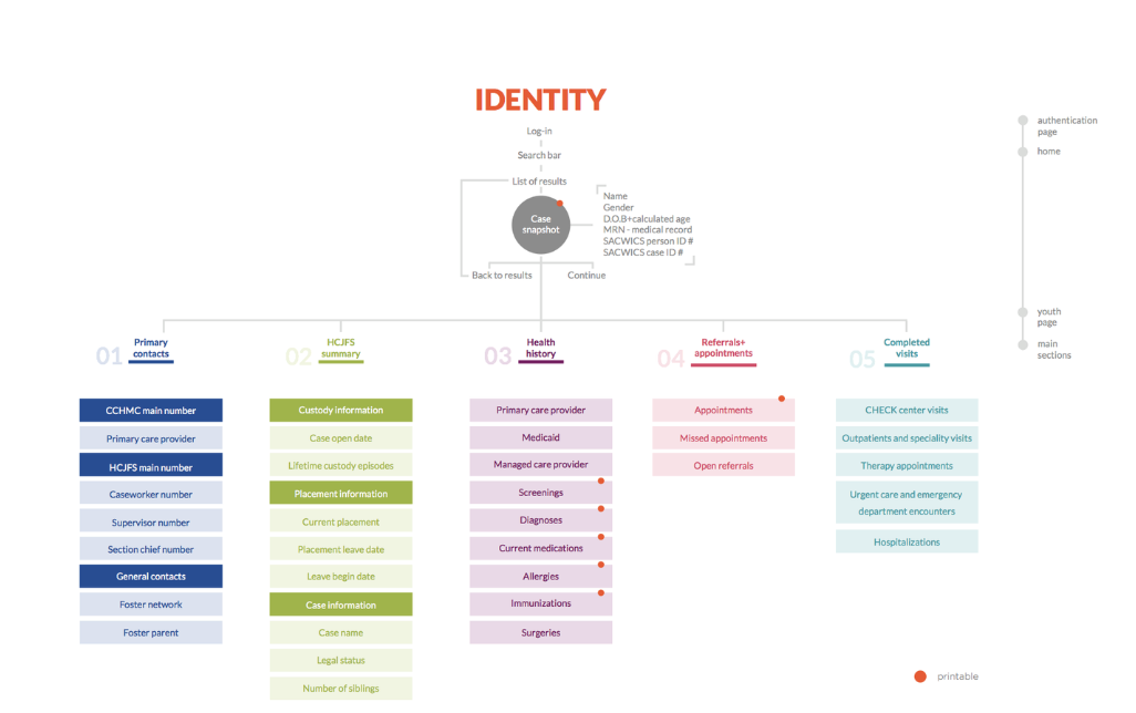
Designed the information architecture from card-sort data instead of org charts — the structure users navigate had to mirror the structure in their heads
A secure digital platform enabling Cincinnati Children's Hospital (CCHMC) and Hamilton County Jobs & Family Services (HCJFS) to share critical medical and legal information about foster children — replacing slow, paper-based exchanges and improving the timeliness and accuracy of care.
This wasn't a blank-canvas product. It was a translation problem: two organizations with entrenched paper workflows, incompatible vocabularies, and very different users — clinicians on one side, social workers and administrators on the other — needed a single interface they could both navigate without training manuals. Whatever I designed had to feel obvious to both groups on day one.
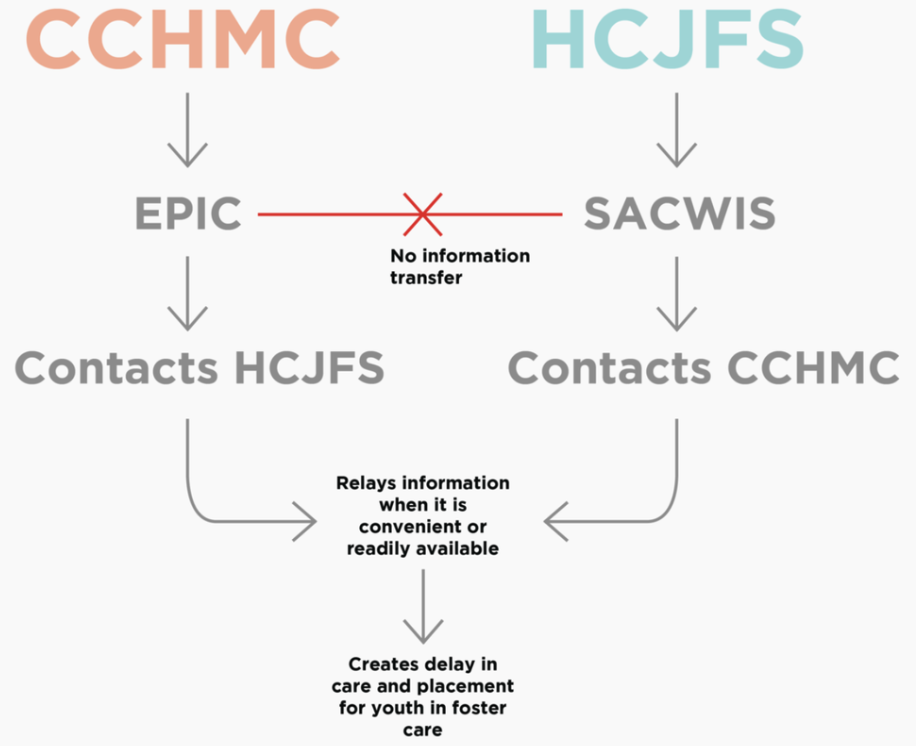
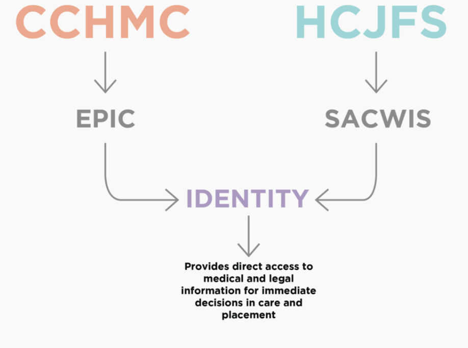
Before drawing a single screen, I needed to know how each user group actually thought about this information — what they called things, what they reached for first, what belonged together in their heads.
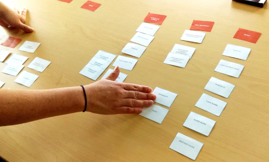
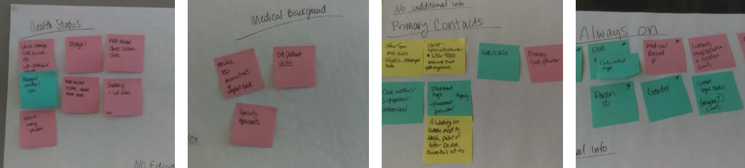
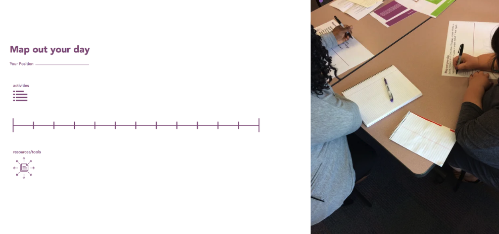
Working with the CCHMC and HCJFS teams, we mapped the current system and defined the goal system. Early sessions with both user groups — social workers, administrative personnel, IT, doctors, nurses, and researchers — focused on their daily activities, tools, environments, and the data they most needed. Then came the activity that shaped the design most directly: a card sort with 18 participants across both organizations, arranging and prioritizing the portal's content. When two organizations disagree about what "case information" means, the card sort is where you find out before the navigation ossifies around the wrong answer.
The IA came out of the evidence: card sort clusters, observational research, interviews, and secondary research together defined the portal's structure. My job was to resolve the tensions in that data — where clinicians and social workers grouped content differently, the structure had to find an organization both could navigate without translation.
I started with medium-fidelity wireframes on paper, reviewed in in-person sessions. That choice was deliberate. With users this busy and this varied — many of them not accustomed to giving feedback on software — paper lowered the stakes. People will redraw a paper wireframe in front of you; they'll politely nod at a polished mockup. The rougher artifact got me honest reactions while everything was still cheap to change.
Once the wireframes stabilized, I developed a high-fidelity interactive prototype and ran cognitive walkthroughs with 15 users from both organizations. The testing question was always the same one the card sort had asked at a different altitude: does the system's structure match the structure in the user's head? Where walkthroughs exposed mismatches — a label that meant different things across organizations, a workflow step in the wrong order — I refined the prototype until users' mental models and the system's model converged. That convergence, not visual polish, was the definition of done.
The portal grew from a single-county pilot to statewide deployment across Ohio by 2020, with nationwide expansion planned — and it made that jump without major redesign. That's the design outcome I'm proudest of: an information architecture sturdy enough to survive scale, because it was built from users' mental models rather than either organization's org chart.
Three peer-reviewed publications (JAMIA, Pediatrics, CincyInformatix) documented the approach, demonstrating that co-design with diverse stakeholders in complex regulated environments produces systems that scale.
This project taught me what design actually is in multi-stakeholder healthcare environments: not producing screens, but negotiating a shared structure that many kinds of experts can inhabit. The most consequential design artifacts weren't the high-fidelity prototypes — they were the paper wireframes and card sort clusters, because that's where the real decisions got made while they were still cheap. The portal's expansion from county pilot to statewide system validated the premise: when the design matches how people already think, adoption isn't a separate problem to solve.